
Published by Particular Books / Penguin, 2013, 252 pages.
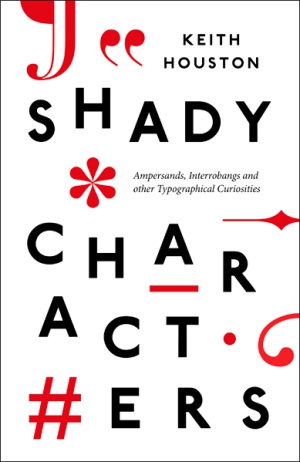
Writing and typeface are things we take for granted, almost as if the letters, punctuation signs and symbols we use have always been around. So it’s good to have someone remind us that behind these characters is a long and interesting history. Keith Houston picks a dozen symbols and gives us the story behind each of them. Some of these we use all the time, such as dashes, quotation marks, ampersands, and the # and @ signs; others have never quite made it, such as the interrobang. Although this might come across as a book that only nerds would enjoy, I would recommend it to non-nerds as well!
In ancient Greece, writing consisted of a string of unbroken words (whichwentsomethinglikethis), and left it to the reader to work out the words, sentences and meaning. And making it even more complicated, lines were written “as a farmer ploughs his field”, in an unbroken string from left to right and then right to left.
Help to the reader came in the third century BC, when the librarian in Alexandria, Aristophanes (not to be confused with the playwright) of Byzantium, created a punctuation system that helped separate the words and make reading easier. These separators consisted of a dot in the middle of the line (known as a komma, indicating a short pause), a subordinate dot (or kolon, indicating a medium pause—a symbol that has become the modern period or full stop), and a high dot (or periodos, indicating a long pause).
When the Romans came along, they got rid of the meandering lines, which now marched left to right in an orderly fashion, with words separated by dots (still used in the “show invisibles” function in today’s word-processing programmes!). However, the Romans could not be bothered with punctuation, and found that even separating the words was too much trouble. As a result, lines, which continued to run from left to right, went right back to being a continuous string of letters.
Another characteristic of Roman writing was that everything was written IN CAPITAL LETTERS to suit chisellers and stonemasons who would carve text into stone or wood. In the 8th century, the Frankish emperor Charlemagne commissioned a standard script to make it easier for his subjects to read. The new script, the Carolignian miniscule, was the predecessor of modern lower case letters.
However, even in the dark ages, when words ran together in a string of capitals, there were marks to separate sections. This brings us to the first symbol Houston looks at—the pilcrow ¶, which we know as the paragraph mark when the “show invisibles” function in word-processors is turned on. Despite its modern use, the pilcrow is actually one of the oldest extant symbols. The early paragraph symbol was a horizontal line in the left margin. In the 12th century, monks began marking sections with the symbol ¢ for capitulum (to which we owe the word chapter). This symbol eventually turned into a reverse P that became the pilcrow.
Another “shady character” is the #, known as the pound or hash symbol. Used extensively now, thanks to Twitter, it is thought to have originated in ancient Rome. It derived from the Roman term for a pound weight, which was libra pondo, written as lb with a horizontal line through the top. It is one of the most versatile signs. Apart from being used to hashtag terms in Twitter, the hash sign is used in touchtone telephones. It also represents weight or numbers, an insertion of a space in proofreading, checkmate in chess, and even sometimes stands in as the musical sharp symbol in musical scores!
This is just a sample of the information packed into this book. Each chapter looks at a particular symbol and its origin and weaves it into a larger tapestry, providing a picture of the history of writing and communication, which is a fascinating story. Read this book—you’ll never take these shady characters for granted again.
Keith Houston also has a website—ShadyCharacters.co.uk—with more information on various shady characters.
